Navigating Time-Series Data

Time-series charts display data of your assets' performance. In Marathon, we provide you with a variety of interactions to navigate through the charts. 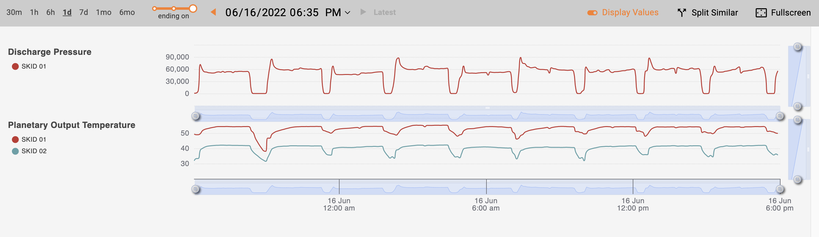
Get Values from Tooltip
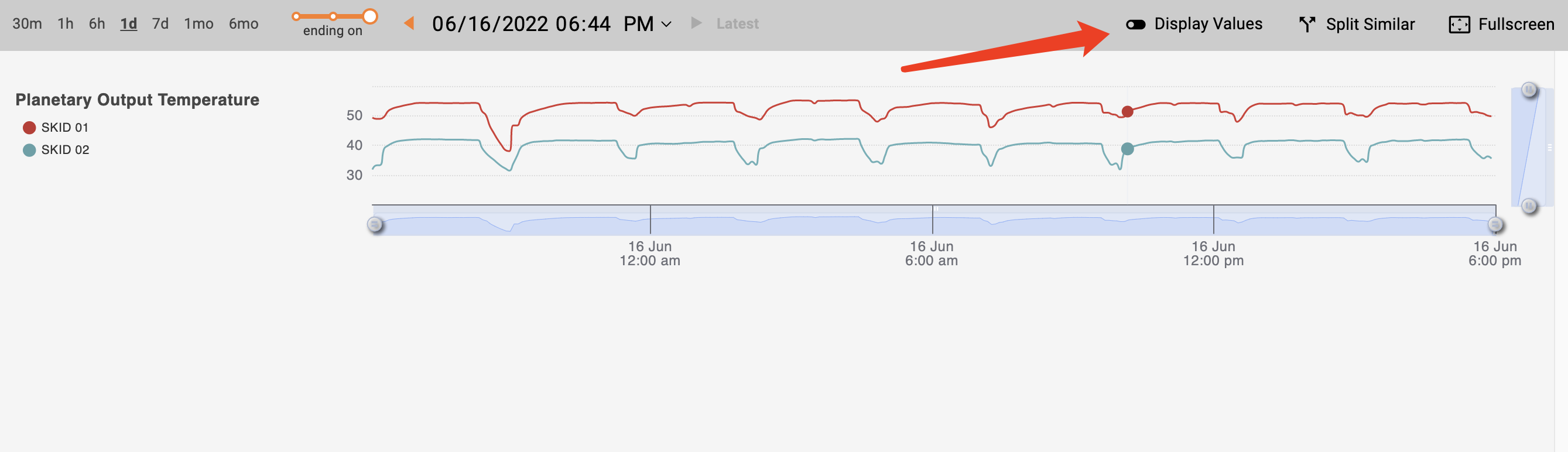
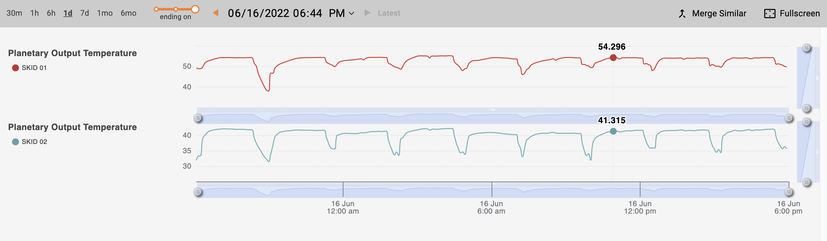
When you hover your cursor over the charts, a tooltip pops up displaying values for the lines or points on the current chart. You can turn off the tooltip using the "Display Values" toggle (enabled by default). 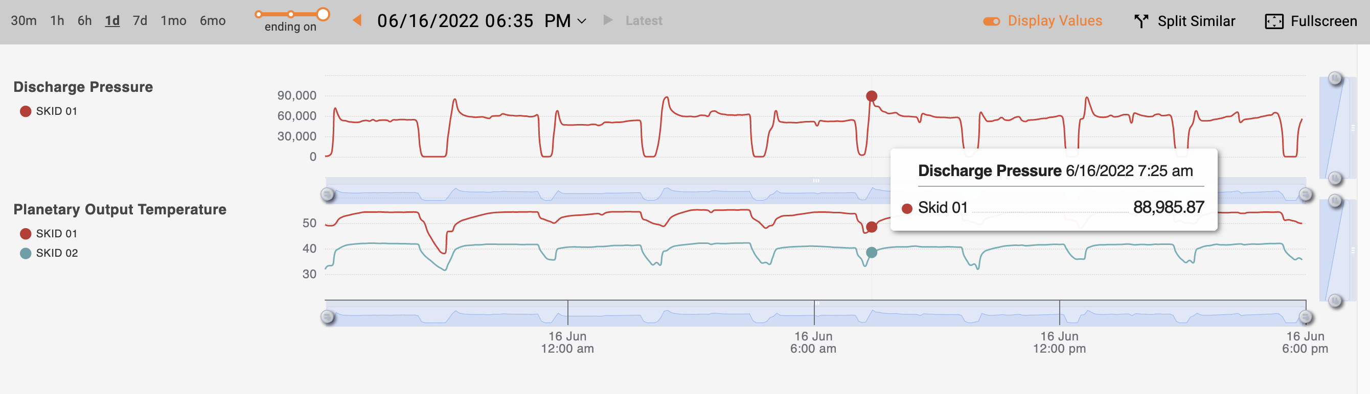
Hide / Show a Specific Asset
You can hide / show a specific asset by clicking on its legend on the left side of the chart.
Fullscreen
If you wish to have a better look at the chart and hide the other content on the screen, you can click the fullscreen button on the top right of the graph.
Split / Merge Data
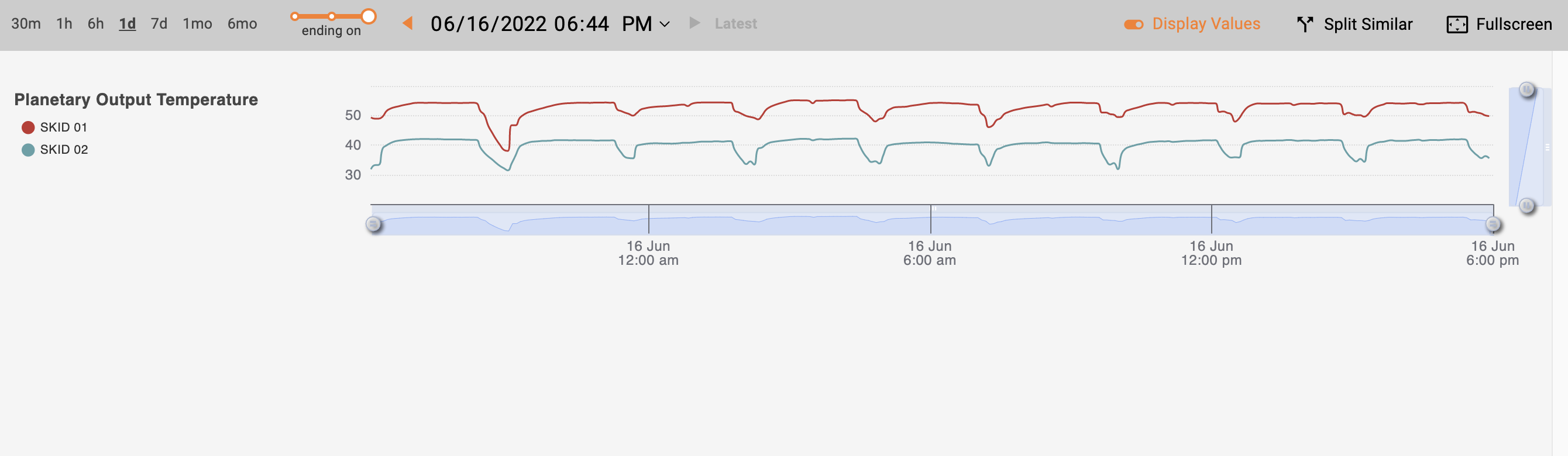
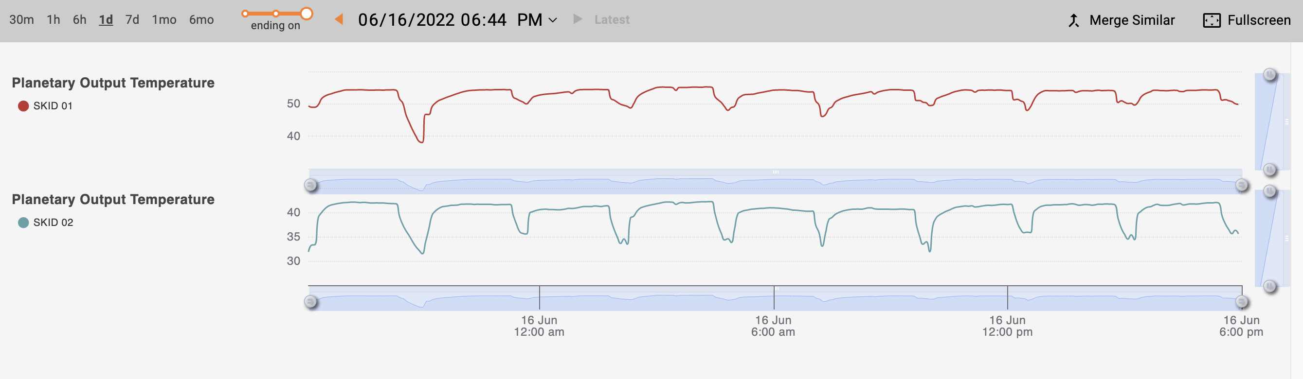
The graph combines time-series data from assets of the same asset type by default. To split the data, click the "split similar" button on the top of the graph.This will split the data and put them on two separate graphs.
Merged view (default)
In merged view, you can turn off the tooltip box that contains the value of the data by clicking the button next to the date picker.
Split view
In split view, values display directly on the lines without a tooltip box.
Change Date Span
You can change the date span to view the data on a larger or smaller scale. On the top left part of the chart, you can choose the time span starting on / around / ending on a date. Marathon will remember your selection and apply it site-wide until you change the date span again. 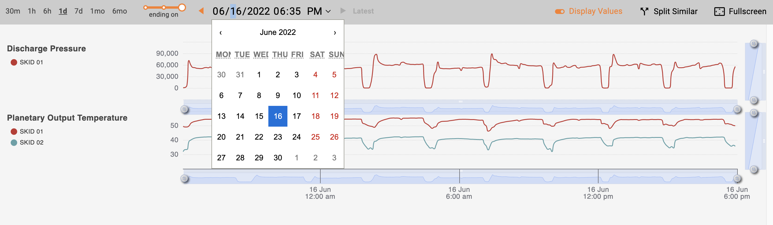
You can use the arrows beside the date to move periodically. The period is based on the duration selected. If you select "1d", then the arrows scroll the chart by 1 day. Clicking on "Latest" brings you back to current time.
Zoom in on a Time Stamp
The slider under each chart offers ability to zoom in. Drag the handles on the left / right most of the slider to adjust the scale, and drag the handle to move across time.