Event Dismissal Summary Reports
Event Dismissal Summary Reports show information about the average (mean) time taken from Event creation to dismissal within an organization. The information presents these data on a monthly basis for the prior six months.
This type of report is opt-in and not displayed by default. It can be scheduled on demand with the default schedule having such a report generated on the 1st day of each calendar month. Note that the report displays a snapshot of information at the time of its creation, it will not update dynamically when further events are dismissed.
Event Dismissal Summary Reports contain four stacked charts on the Report's Summary tab.
Event Dismissal Time Overall
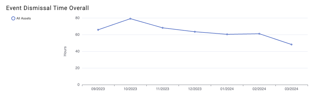
The overall chart shows the month by month information for all Events across all Assets within an organization. An individual data point will take the time average from Event creation to dismissal for Events which were created within that calendar month and already closed at the time of report creation.
Percentage of Events Closed
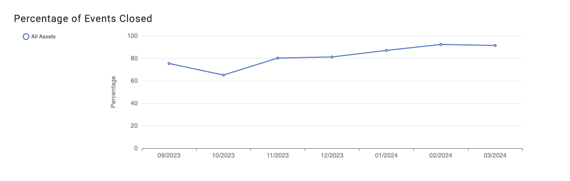
To provide additional context a chart is provided to show what percentage of Events created within a calendar month were already closed at the time of creation. This is therefore the percentage of events in a calendar month which were used to calculate the data shown in the other charts of the report.
Event Dismissal Time by Asset
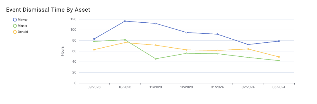
To provide additional granularity the calculated mean time to dismissal is displayed with data partitioned by the top level Asset within an organization, e.g., Vessel in the example shown. The legend to the left of the plot will show the full list of Assets. Clicking on a legend item will add and remove its associated line on the chart.
Note that if 10 or more items are displayed on a chart the line colors will begin to repeat, it is recommened to interact with the chart legend as described above to resolve ambiguity between Assets when they are represented by lines of the same color.
Event Dismissal Time by Event Description
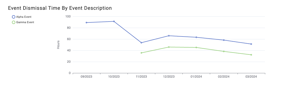
A further partitioning of the data shows the information calculated grouped by different Event descriptions, also known as Event Types. The same interaction is possible with the legend to customize which lines are shown on the chart.